


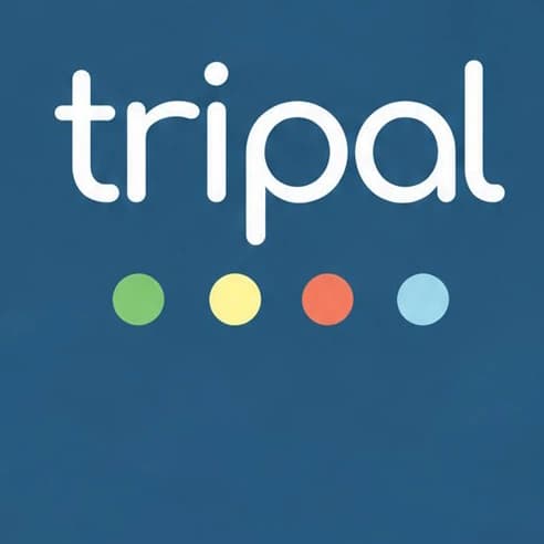
Tripal is a soft lowercase wordmark with round ends and an open, easy rhythm — and underneath it, four dots in four colours. Slate and white carry the page; the dots add the joy. On their own, those four dots become the brand's most flexible tool: progress, categories, a signature, a pattern. The whole system is small, friendly and built to travel with people.
Palette
- Slate#2D5A77
- Leaf#8AC477
- Sun#F8EC8A
- Coral#F4794F
- Sky#A1D1DF
Typography
Nunito ExtraBold · Nunito