


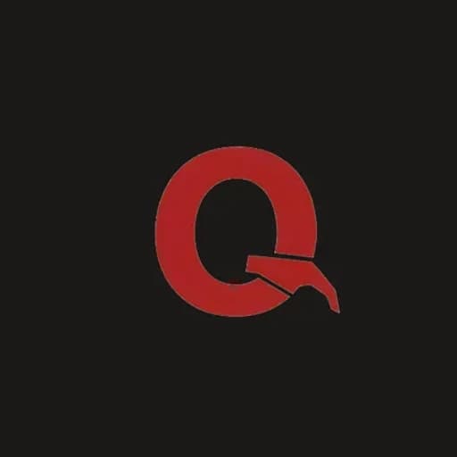
Qassab Oil moves fuel and lubricants across the Kurdistan Region — on tankers, in drums, out of a yard. The identity had to survive all of it: sprayed through a stencil, stitched on a pocket, printed on a card, and read from the far end of a forecourt. So the whole brand was built from one letter. The Q of Qassab is a heavy ring whose tail breaks off, turns into a spout and lets a single drop fall — oil, stated without a picture of a barrel.
Palette
- Qassab Red#A82626
- Crude Black#0E0E0E
- Paper#F2F0EC
- Steel#6E6A66
Typography
Anton · Inter Tight