


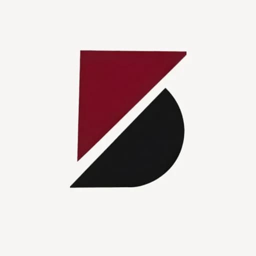
Blade is a general trading company — it buys and sells, imports and exports, and moves goods from the port to the shelf. The identity had to be as decisive as the business: one mark that works big on a container, small on an invoice, and clean on a kraft carton. So we drew the whole brand from a single idea — a B split by one 45° cut, two blades locked together: buying and selling, in and out.
Palette
- Blade Maroon#731021
- Blade Black#151414
- White#FFFFFF
- Steel Grey#8C8886
- Carton#D9D5D1
Typography
Space Grotesk · JetBrains Mono